How The New York State License Plate Should Look
After some news this week about New York State unveiling new license plate designs, let’s talk about the proposed designs, and why they’re all wrong
by Chris Clemens
The New York State Department of Motor Vehicles announced on Monday that a new license plate design was slated to hit our bumpers next spring. They’ve chosen five designs, and are allowing us to vote on their favorite using this website. Once a final tally selects a winner, the new design will be ready to roll in April 2020.
It’s cool that people are allowed to have input, but the only way to vote is to select one of the five designs. Instead, really, there should be a sixth option that says, “all of these are terrible”.
I’ll attempt to walk you through my reasons rather than just plainly pooh-poohing the whole thing. Let’s go through them one by one. Then, I’ll offer up my not-asked for opinion about what the final design should really be.
License Plate History
You didn’t think you’d get away with just a quick opinion piece and not have to sit through at least a little history lesson, right?
This isn’t just about being the Empire State and by default the best at figuring things out. New York State was the first in the nation to even have license plates on automobiles. It all began in 1901, but at that time they weren’t state issued. You were required to have a registration plate on your vehicle, but you made your own. At that time, people just used their initials, which was probably helpful since a lot of the cars looked the same in 1901.
It was Massachusetts that finally issued a state government issued plate system in 1903. The very first plate was just simply a number “1” and was issued to a Frederick Tudor. If you’re wondering, a descendant of Tudor still has it. Seven years later in 1910, New York got on board with the state issued plates.
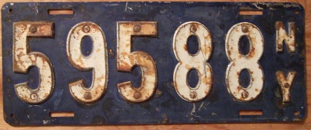
Since those early days, things have changed a lot. As you can imagine, everyone kind of did their own thing with plates so from state to state they looked wildly different. It was in 1956 that the U.S., Canada, and Mexico came together and decided on a specific size of plate that everyone had to use. New York was the first to implement using the new size in 1957. I’m guessing it was the last time all three countries agreed something.
If you’re real curious, this Wikipedia page has an awesome list and description of each New York plate beginning with 1910.
Ok! On to modern times and the New York State license plate of 2020!
Plate 1
I do actually kind of dig the blue font of the main lettering. But, why would the “New York” at the top be in a different color blue? Why complicate things and use different colors?
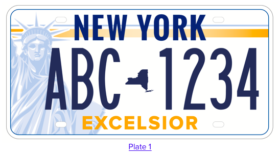
For many people, I’d think that the Statue of Liberty in many ways is associated with the celebration of America as a whole. The Statue is absolutely an icon, and probably a New York one, but I’m just not convinced that it aptly represents all of New York State.
Plus, Lady Liberty has already been on a New York State license plate in the past. Let’s allow her to rest in retirement.
Plate 2
YEAH! The blue font from the main lettering now matches the color in the “New York” at the top! I dig that. But, someone really, really, still thinks the Statue of Liberty belongs on the plate. I just can’t get behind it.
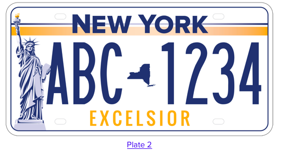
Plus, even though “Excelsior” is technically the motto of the Empire State, I’m just not convinced it needs to be on a license plate.
But, if you’re forcing me to choose between plate 1 and 2, I guess I’d take 2.
I guess.
Plate 3
One thing I haven’t touched on yet is how the colors of a license plate will look on your car. In my humble opinion, I don’t want to spend a ton of money on a car to have the license plates look gaudy and standoutish.
I’m not a designer, I just have opinions. But, I know that graphic designers very much like using colors that compliment one another. I also know that an orangey-yellow font with blue might go with one another, but does it really go with a maroon car? Not really.
I’d just prefer that the plate colors don’t clash with the exterior color of the car. I know it’s a small thing, but details are important!
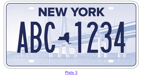
That being said, of all five of these designs, #3 is the least likely to clash with a car’s exterior paint job. It might not go perfectly, but in most cases a light blue won’t be as terrible as a mixture of colors.
So, of these first three, I’d totally take this one.
Except, do I really want to drive around Upstate with an image of the formerly-known-as Tappan Zee Bridge? Not really. It’s technically not in New York City, but let’s face it, most people associate it with getting there.
Plate 4
I’m trying really hard not to be unncessarily snarky in this post, but… my god.
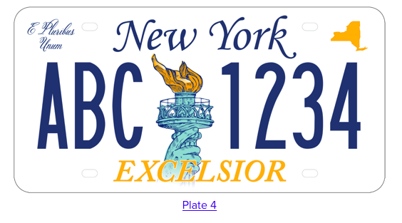
No.
Not ever.
There’s four different fonts used here! Plus, how many people use a license plate frame? The E Pluribus Unum and the top edge of New York is gonna be covered. The biggest problem I have with this license plate is that it’s too complicated. This one is the most unncessarily complicated of them all.
Plate 5
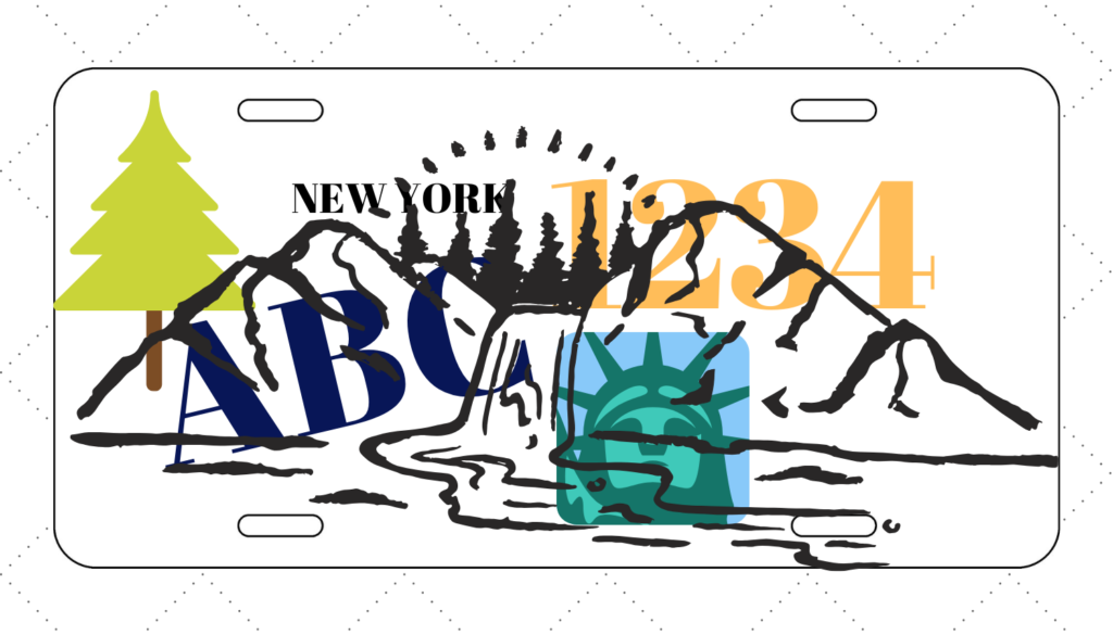
Admittedly, if I was forced to chose one of the five in this lineup (and, apparently I will be), it’d be this one. I don’t like it, but I don’t hate it as much as the other four.
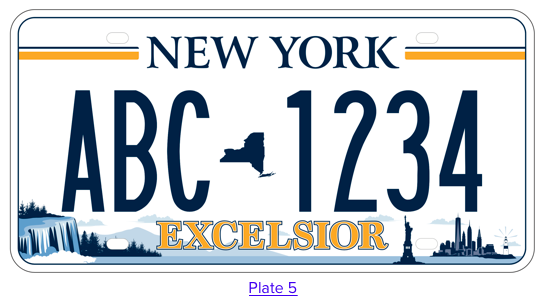
The Statue of Liberty shows up again, but it’s so small I’m not sure it will ever be recognizable on a license plate. That’s not to say I’m pleased about that, because I don’t feel a need to hide Lady Liberty if she’s gonna be on the plate. But, making it smaller means it probably won’t even be noticed on a plate, so why have it at all?
Because it’s small though, there’s room to fit some other imagery. Taking up some of that additional space is now a New York City skyline, but also a little waterfall and a tree line graphic. I presume that someone felt bad that all the others were so New York City that they should throw in an Upstate icon somewhere. Like, ya know, down there in the corner real small.
NOBODY PUTS UPSTATE IN THE CORNER!
There’s only two colors now, which I like a lot more, but we’re back to multiple fonts. The whole thing just feels like it’s too much in a small space all crammed in. In some tattoo shops, they call this “trying to fit 50 pounds of crap into a 5 pound bag”.
New York and License Plates
So will I ever be happy? Probably not. But, that’s only because my concept for a license plate would never be a reality.
The fact of the matter is, it will be impossible for any single plate to please everyone. I get that. We’ll never truly agree on anything across the board. For instance, someone thought each of those designs above was a good idea, or they wouldn’t exist. (I’ve been wondering if these were five finalists and there were others that didn’t make the cut!)
We know there’s somewhat of a cultural division between Upstate and New York City, and there’s no sense in throwing coal on those fires by using imagery from one or the other. Especially because there are wwaayyy more cars registered in the rest of the state than in New York City. According to this document from the NYS DMV, there are 8,957,301 million registered cars in New York State outside of New York City. Within in the city, there’s only 2,189,374.
Instead, why not take away any iconography that represents anything in particular?
It’s a license plate.
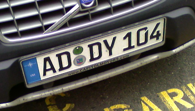
It needs to function as a way to deliver numbers and letters. That’s all it has to do. Kinda of like European license plates. Straight and to the point with numbers and letters. Even this European style plate is dressed up a bit and still isn’t obnoxious.
My New York License Plate Concept
So if you’re sick of me complaining and wish I would just get on with it already, here ya go!
My concept for a license plate would simply be numbers and letters, and I guess mention the state if you want.
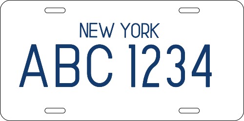
This gets the job done and allows people to read the numbers, it isn’t complicated, and it isn’t unnecessarily flashy and graphic loaded. It’s simple, clean and straightforward and represents everyone in the state equally.
Most importantly, there’s no need for a committee of people to spend time using taxpayer money to sit around a table and pay graphic designers an outrageous sum of money. Let the government folks spend time on something else other than license plates and keep everything simple.
This will look good on a white car, or a gold car, or a black car. It will be timeless so we don’t have to keep updating it every few years. It will take seconds to create and there’s no need to use valuable government resources attempting to a design and roll out something new. The only time you’ll have to buy a new one is if yours is wrecked or you want new numbers.
Or, if they start to peel, of course.

Chris Clemens is the Founder/Publisher of Exploring Upstate. From his hometown in Rochester, he spends as much time as possible connecting with the history, culture, and places that make Upstate New York a land of discovery. Follow him on Twitter at @cpclemens




August 21, 2019 @ 10:15 am
1. A good graphic designer is worth every penny.
2. This reeks of an upper-level executive saying, “I’m not going to waste money on something my secretary can make using free clip art. Karen, give me five license plate options by 2pm.”
3. I highly doubt a degree in graphic design was in Karen’s job description.
4. Beef up your “New York” line weight and adjust the kerning, and I’ll vote for yours any day. ;-p
August 21, 2019 @ 8:22 pm
Great take Chris on the designs that have been given to the public to “vote on”.
Always agree that the KIS (Keep It Simple) concept just makes sense!
Your design gets “my vote!”
August 21, 2019 @ 9:02 pm
My husband is a designer and he says the only acceptable option is #3. hahahah… So I had to vote for that one. Though we were laughing about the bridge because we had no idea what bridge it was. He really dislikes the Excelsior on all of the others. I kind of like #5. Our cars are 11 years old and still have the white/blue license plates because we really do not like the look of the orange plates. I think we should just copy Texas. Their white plates with the black letters are by far the coolest looking that I’ve seen in the states. It would look sweet on the Range Rover that I want to get but can’t really afford! 🙂
August 22, 2019 @ 7:26 am
Great post! I choose 3 also in the interest of keeping it simple. But it is nowhere near being good. That said, intervention is sorely needed from professional graphic designer (and not an artsy relative or friend of our governor). I agree with not defaulting to the hideous blue and orange color scheme (think: the eyesore, and now, thankfully, defunct Shea Stadium). (Notice also on plate no. 3 the background photo of the bridge looks suspiciously like the bridge our governor spearheaded with much hoopla down here in Queens LOL).
August 23, 2019 @ 10:18 am
I picked #5 – because I just couldn’t pick any of the others. Let’s hope that these new plates don’t peel . . .
August 24, 2019 @ 11:59 am
It was suggested by someone to feature an open wallet being pilfered.
However…
How about a plate that is just a barcode?